FAQ About Gestalt Principles of Design

What does Gestalt mean?
Gestalt is actually a psychology term and it hypothesizes that people tend to organize visual elements into groups when certain principles are applied. The word literally translated into "unified whole" and this theory was developed by several German Psychologists in the 1920s.
For example, if you see squares that have the same color and size placed next to each other, you perceive them as having a relationship rather than as two separate elements.
Basically, according to Gestalt psychologists, the whole is different from the sum of its parts. Therefore, the whole is more than its individual elements.

What are the most basic rules of Gestalt Principles?
Humans will always perceive objects in their simplest form. If you see a 2D illustration of interlocking circles, you would perceive them as different circles rather than what it physically is, curves that are split by other curves. Basically, humans don't see shapes as individual elements.
Secondly, humans naturally follow curves and lines. For example, even though dashed lines have separate shapes of small lines by human nature we perceive the dashed or dashed curve as single elements.
Thirdly, the mind will attempt to fill in details and gaps that aren't actually there. This also applies to our first example where the human eye sees a complete circle even though it is interlocking with other elements. If there is no information but it is implied, our mind will subconsciously fill in the blanks.

What are the main principles that the Gestalt theory defines?
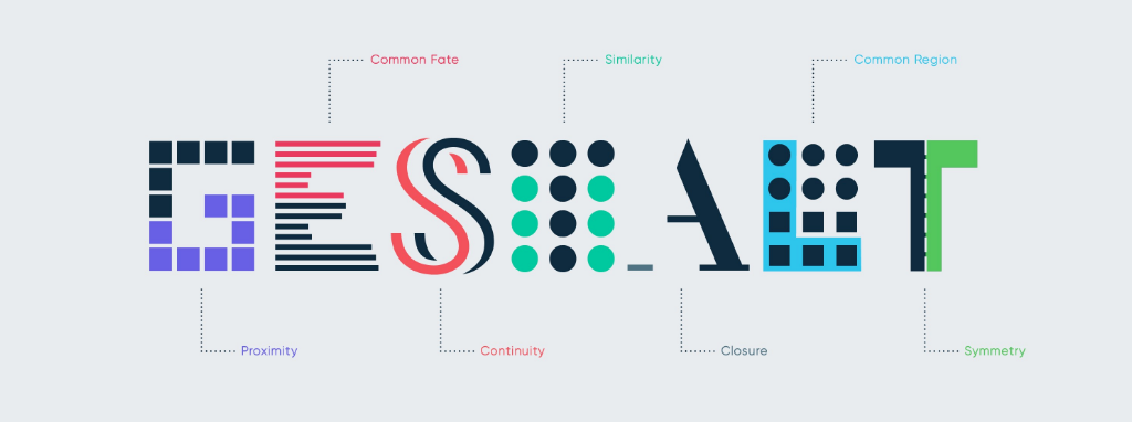
Continuation, closure, proximity, similarity, symmetry, figure & ground. It is also important to note that several Gestalt principles can be applied in the same design and oftentimes if they are used together in a design it is a more compelling and interesting design.

What is the Continuation principle?
The law of continuity posits that the human eye will follow the path when viewing elements whether it's a line or a text regardless of how they were actually drawn. We can use lines to capture and guide users towards important elements within a design interface.
Continuation occurs when the eye is compelled to move through one object and continue around other elements. This implies a relationship between the elements.

What does closure mean in terms of the Gestalt Principle?
Closure occurs in design when an element is incomplete or not totally finished. The space is not entirely enclosed, but if enough of the shape is there then the human mind will subconsciously fill in the missing information.
Closure is quite often used in logo design. Such examples include WWF, Adobe, NBC, Volkswagen, and many more.

When does Similarity occur?
Similarity occurs when objects look similar to one another. The viewer will perceive them as a group or pattern. These similarities can be found in similar shapes, colors, sizes, and textures. This principle is probably the easiest to understand but also the broadest of the Gestalt principles.
When objects are similar, another object can be emphasized by making it different than similar ones. Then, you are automatically compelled to see the elements which are emphasized. This is known as the Anomaly theory and it is an additional feature of the similarity principle.

What does proximity mean in design?
Proximity refers to how close elements are to one another. Therefore, it occurs when elements are placed next to each other. The position of the elements helps us to portray a relationship between the separate parts. The opposite is also true. By putting space between different design elements, you can add separation when their other characteristics are the same. If there is no proximity, there is a perception of a lack of relationship between the elements.
In UX design, proximity is used to get users to group certain things without using any boxes or whatsoever.

Can the Symmetry principle be used in logo design?
Yes! Most logo designers use symmetry to create a more balanced logo. Big brands such as McDonald's, Mercedes-Benz, Volkswagen, Target, Walmart, Audi, and Starbucks use symmetry in their logos. Most basically, symmetry occurs when identical elements are folded and you get the same elements wherever you fold them. Several symmetries can occur at the same time in one design (vertical, horizontal, diagonal symmetry..)

What does figure & ground mean?
The figure (positive space) and ground (negative space) principle is probably the most difficult one to understand. In terms of design, the figure refers to the object and the ground is the background. When looking at a visual element, people tend to look for ways to differentiate between the figure and the background.
1-Size: Images and visual elements that appear to be larger will be perceived as closer and as part of the figure.
2-Contrast: Use of high contrast can lead people to differentiate between the figure and the ground.
3-Blurriness: A blurred or out-of-focus element will give the effect to be the background.
The figure and ground principle can be used to create illusions in design.
