FAQ About Mood Board

How can color theory be applied to creating a mood board?
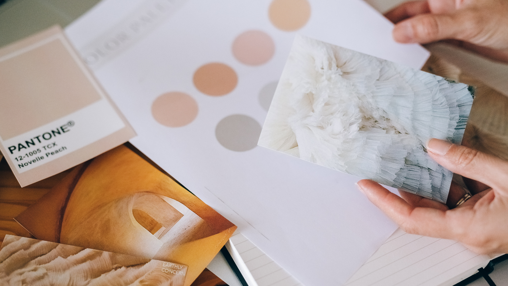
Color theory can be applied to creating a mood board by using color combinations and palettes that evoke the desired mood or feeling. Different colors are associated with different emotions and moods. For example, red is often associated with energy, passion, and excitement, while blue is associated with calmness, trust, and reliability. Choose colors that align with the desired mood for the project.
Color harmonies are combinations of colors that work well together. For example, analogous color harmonies use colors that are next to each other on the color wheel, while complementary color harmonies use colors that are opposite each other on the color wheel. Use color harmonies to create a cohesive and balanced color palette on the mood board.
Saturation refers to the intensity of a color, while contrast refers to the difference between light and dark colors. Use variations in saturation and contrast to add visual interest and depth to the mood board.
Colors can also be used to establish a brand identity and create brand recognition. For example, McDonald's is known for its use of red and yellow, while Coca-Cola is known for its use of red. Use color to establish a consistent visual identity across different brand materials.
