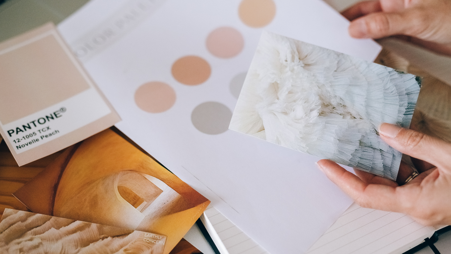
FAQ About Mood Board

What are some common mistakes to avoid when creating a mood board?
Here are some common mistakes to avoid when creating a mood board:
- Including too many images: Including too many images can be overwhelming and may dilute the visual impact of the board. Be selective and only include images that are relevant to the project and convey the desired aesthetic.
- Using low-quality images: Low-quality or pixelated images can make a mood board look unprofessional and can detract from the visual impact. Use high-quality images that are clear and crisp.
- Not focusing on the purpose: A mood board should have a clear purpose and should be tailored to the specific project or design brief. Avoid including images that don't serve the purpose or that are irrelevant to the project.
- Not including enough variety: A mood board should include a variety of images that represent different aspects of the design or concept. Avoid using too many images that are too similar or that don't show enough variation in color, texture, or style.
- Forgetting about typography: Typography can be just as important as images in setting the tone and aesthetic of a design. Make sure to include examples of typography that fit the desired style and mood.
